#UX Research
#Motion Design
#UI/Visual Design
#Illustration
Design for Usability course at MFA Design & Technology at Parsons School of Design
UX Designer & Reseacher
Figma/FigJam, Google Apps (Docs, Slides, Forms...)
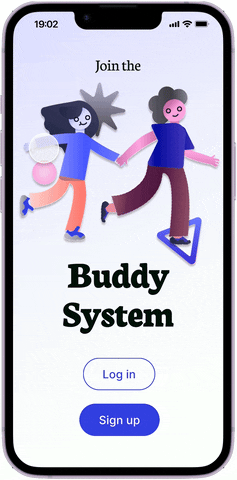
Buddy System is a Minimum Viable Product (MVP) developed over the course of 16 weeks during a Design for Usability course at Parsons. This project goes through the entire user experience design process: from research, to interface design, and finally, a testable prototype.
.png)

In a survey by MTA, 41% of respondents said they were using subways less frequently. Out of that number, 44% percent cited personal security.
Riders don’t feel safe using the subway, especially during night time.
Open Questions
Competitive Research
9 competitors were analyzed, including the Citizen app, Nextdoor, and the Neighbors app by Ring. Key insights included: 1. There are no apps specific to underground subway routes (where people are most vulnerable without cellular service), and 2. Community-run discussions, if left unrestricted, turn to racial profiling and political extremism.
Proto-personas
Proto-personas are generated based on the previous research and assumptions of the problem space. The details & assumptions for these proto-personas are then organized into groups. This is solely to get assumptions out in the open in order to direct next steps in recruiting for user interviews/surveys.


7 NYC residents were interviewed in-person about their experience with public transit and the subway and the responses were recorded via Google Sheets.
17 responses were collected from an email survey with the same questions. Respondents included students, professors, product designers, and artists from neighborhoods like Brooklyn, Jersey City, the West Village, and Queens.
Select Quotes:
"Even though the police are there, I feel like they only want to catch people who evade fares"
"I wish I had reception or wifi... If I knew I could contact someone in an emergency... that would be a game changer."
"We have no control over our safety. [We do] whatever makes the individual person feel like they have more control."
Women and minorities feel unsafe on the subway. Whether something has happened to them or to someone they know, everyone has a story of a subway incident.
Key Insights
Ranking Least to Most Helpful
In both in-person and email surveys, Iasked users to rank the following rom most to least helpful. The list was based off preliminary research and an SME interview.
Buddy Systems was identified as most helpful by 14/25 respondents.

Items ranked as "Most Helpful"
User Story
I storyboarded out a scenario where a “buddy system” app that matches people together for their commutes. In the storyboard, a young woman has to commute someplace alone but is not comfortable doing so. Driven to feel more comfortable in her late night commute, she opens the "Buddy" app and inputs a start and desired end journey. She matches with someone who is also travelling in that direction, they commute together, and then seperate once they arrive. This gives insight on the key tasks to include within the app's user flow, as well as any gaps.

Main User Flow for "Buddy Matching"

Paper Prototype
A paper prototype was play-tested by users before working in Figma, and notes were made directly onto the original sketches for future iterations.


Mid-Fidelity


Refining the Match Page
Demonstrating the iterative process, I created multiple versions of each screen for peer review to determine which is the most intuitive and appeal. The following is but one of many examples.


Usability Testing
To refine the concept into a final prototype, the clickable prototype was tested on various potential users. 5 potential users were tested with task-based questions from the above script and high fidelity prototype. From these rounds of testing, I analyzed the data and found that the next necessary improvements were:


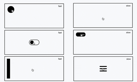
Visuals are illustrated in Adobe Illustrator and then animated with the Smart Animate function within Figma. This makes the app more playful and inviting, alleviating the fear that comes with traveling alone.
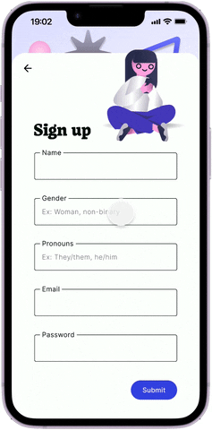
The sign-up includes animated instructions, as the illustration demonstates photographing their ID on the Identity Verification page. The sign-up also includes inclusive gender/pronoun options and info for a more secure password.
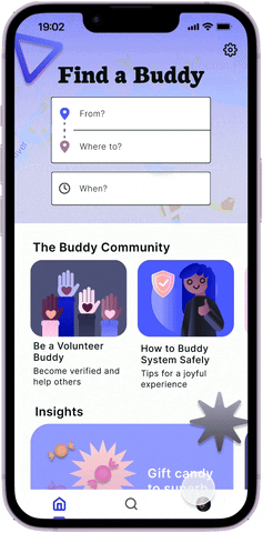
Helpful hints and knowledge articles are provided on the homepage, discussing topics like: How to use the "Buddy System", the app's reward system, and volunteering as a buddy.
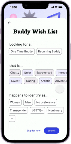
On sign-up, users are asked to fill out their buddy preferences. This informs the back-end, helping users match to their ideal buddies. Everyone’s ideal buddy is different. A person may be more comfortable with a person of their own gender identity, and others may prefer a silent buddy.
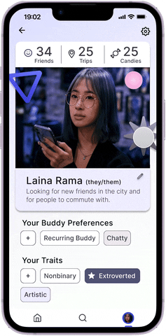
Profiles host a person’s Buddy Preferences and Traits. This is where those selections can be checked or edited. The information on this page is also the information shown when matching with others.
Instead of the usual 5-star rating system, users can give each other a “trait”. Once a trait has been given enough times it will be automatically assigned to them with a star. Some may prefer “chatty” buddies, and others may prefer “quiet” buddies.
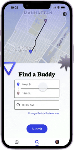
The search input requires a desired start/stop location and time.
The carousel includes traits and profile metrics to inform choices
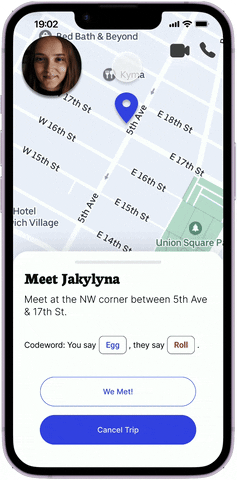
Once a buddy is chosen, the user must Meet their Buddy > Travel to their Destination > Complete the Trip > Leave a Review. The user flow includes the following:
.png)
The necessary future improvements include heightening the security and user flow options for worst-case scenarios: